
The three main types of web design are static, dynamic, and responsive. Static web design offers fixed HTML/CSS structures with consistent presentation and faster loading times, making it ideal for portfolios and brochures. Dynamic web design features real-time content changes and database integration, perfect for e-commerce and social platforms that need frequent updates. Responsive web design uses fluid layouts and flexible images that adapt to different screen sizes, ensuring your website works well across all devices. Each type has its unique benefits and applications, and understanding their differences will help you choose the right approach for your specific needs.
Key Takeaway
- Static web design uses fixed HTML/CSS structures to deliver consistent content without server-side processing, ideal for simple business websites.
- Dynamic web design allows real-time content updates through database integration and CMS systems, perfect for e-commerce and social platforms.
- Responsive web design ensures websites adapt to different screen sizes using fluid layouts and flexible images.
- Static websites offer reliability and security, while dynamic websites provide advanced functionality and real-time data processing.
- Each type serves different purposes: static for stability, dynamic for interactivity, and responsive for device compatibility.
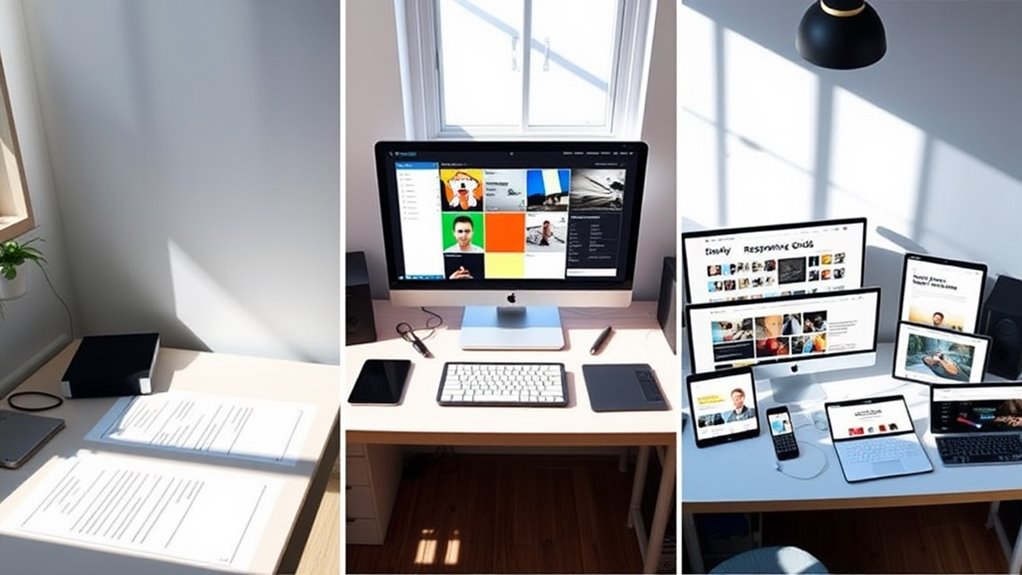
Static Web Design
Static web design's most defining characteristic is its unchanging, fixed content presentation. When you're working with a static website, you'll find that the HTML code remains constant, and the pages display identical content to all users at all times.
Key Characteristics:
- Fixed HTML and CSS coding structure
- No server-side processing required
- Faster loading times compared to dynamic sites
- Lower development and maintenance costs
- Limited functionality for user interactions
Benefits You'll Experience:
- Reliable performance across different browsers
- Simplified hosting requirements
- Enhanced security due to fewer vulnerable points
- Excellent for small businesses with stable content needs
- Cost-effective solution for basic online presence
You'll find static web design particularly suitable when:
- Your content updates are infrequent
- You're operating with a limited budget
- Your website serves primarily as an information portal
- You need guaranteed consistent presentation
While static websites don't offer real-time updates or user-specific content, they're ideal for portfolios, brochures, and landing pages. You can expect 99.9% uptime due to their simplified structure, and they typically cost 40-60% less to develop than dynamic websites.
Dynamic Web Design
Unlike its static counterpart, dynamic web design enables real-time content changes and personalized user experiences through server-side processing. You'll find that dynamic websites adapt to user behavior, preferences, and data inputs, creating a more interactive environment.
Key Features of Dynamic Web Design:
- Database integration that lets you store and retrieve user data
- Content Management Systems (CMS) allowing quick updates without coding
- User authentication and personalized dashboards
- Real-time data processing and updates
When you're working with dynamic websites, you'll notice they're particularly beneficial for:
- E-commerce platforms where inventory changes frequently
- Social media sites that update content continuously
- News portals requiring constant content updates
- Member-based websites with user-specific content
The technology behind dynamic websites includes:
- Server-side programming languages (PHP, Python, Ruby)
- Database management systems (MySQL, PostgreSQL)
- API integrations for third-party services
- Advanced caching mechanisms
You'll need to take into account that dynamic websites typically require more server resources and maintenance than static sites. However, they offer superior scalability and can handle complex functionalities that modern web applications demand, making them ideal for growing businesses and content-heavy platforms.
Responsive Web Design
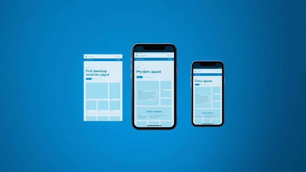
Modern websites must adapt seamlessly across all devices and screen sizes, which is exactly what responsive web design delivers. When you implement responsive design, your site automatically adjusts its layout and content to provide ideal viewing across smartphones, tablets, laptops, and desktop computers.
Key Features of Responsive Design:
- Fluid grid layouts that use relative units (%, em, rem) instead of fixed pixels
- Flexible images that scale within their containing elements
- CSS media queries that apply different styles based on device characteristics
You'll find that responsive design offers several business advantages:
- Reduced development costs, as you'll maintain a single website instead of multiple versions
- Improved SEO performance, since Google prioritizes mobile-friendly sites
- Better user experience, with 94% of users citing easy navigation as essential
Implementation Guidelines:
- Start with a mobile-first approach to guarantee essential content remains accessible
- Use breakpoints strategically to enhance layouts at different screen widths
- Test thoroughly across multiple devices and browsers
- Optimize images and media for faster loading times
Conclusion
You'll find that static, dynamic, and responsive web designs each serve unique purposes in today's digital landscape. By coincidence, these three approaches have evolved alongside your changing online needs, making it easier to choose the right design for your specific project. Whether you're launching a simple blog, an e-commerce site, or a mobile-first platform, you've got the perfect design solution waiting within these three fundamental types.