To make your flyer stand out, you'll need to master five key design elements that work together. Start with purposeful color psychology, using a limited palette of 2-3 colors that align with your message and maintain strong contrast ratios. Implement smart typography by using no more than three complementary fonts with clear size hierarchy (30-36pt headlines, 18-24pt subheads, 10-12pt body text). Incorporate strategic white space (25-30% of design) to boost comprehension by up to 20%, position a single clear call-to-action in the bottom third, and guide viewers through your content using the Z-pattern principle. These fundamentals form just the foundation of creating attention-commanding flyers.
Key Takeaway
- Strategic use of 2-3 bold colors creates visual impact and evokes specific emotional responses while maintaining professional appeal.
- Clear hierarchy through contrasting typography guides readers naturally through information, with headlines 3 times larger than body text.
- Effective use of white space (25-30% of design) enhances readability and prevents visual clutter, increasing comprehension by up to 20%.
- One prominent call-to-action with strong action verbs placed in the bottom third ensures clear direction for audience response.
- Z-pattern layout arrangement follows natural eye movement, creating an intuitive flow from headline to important details to call-to-action.
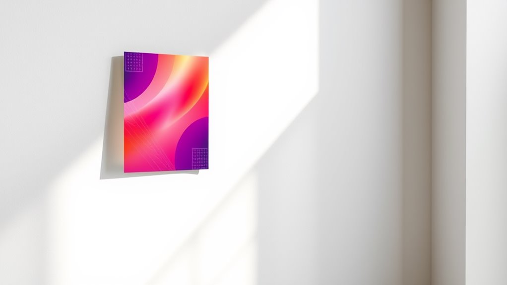
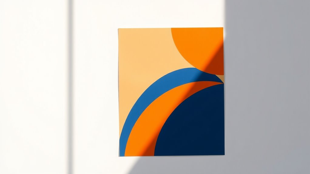
Purposeful Color Psychology
Colors can make or break your flyer's impact before anyone reads a single word. Understanding color psychology helps you leverage emotional responses and create a visually compelling design that resonates with your target audience.
Key Color Associations to Reflect On:
- Red: Creates urgency, stimulates appetite, triggers excitement
- Blue: Builds trust, conveys professionalism, promotes calmness
- Yellow: Captures attention, sparks optimism, enhances clarity
- Green: Suggests growth, represents nature, encourages action
- Purple: Implies luxury, radiates creativity, appeals to wisdom
Strategic Color Implementation:
- Use your brand's primary colors as dominant elements
- Apply the 60-30-10 rule: 60% dominant color, 30% secondary color, 10% accent color
- Keep contrast ratios at 4.5:1 minimum for readability
- Limit your palette to 2-3 colors for maximum impact
You'll want to reflect on your audience's cultural backgrounds, as colors carry different meanings across cultures. For example, while white represents purity in Western cultures, it's associated with mourning in some Eastern societies. Test your color combinations with sample audiences before finalizing your design, and verify they align with your message's intent.
Hierarchy Through Smart Typography
While color creates visual interest, typography builds the roadmap for your reader's journey through the flyer. You'll want to establish a clear visual hierarchy using font choices that guide attention to key information.
Key Typography Principles:
- Use no more than 2-3 complementary fonts
- Maintain a size ratio of 3:1 between headers and body text
- Keep body text between 10-12 points for ideal readability
Creating Visual Flow:
- Headlines: Choose bold, attention-grabbing fonts that are 30-36 points
- Subheadings: Select semi-bold variations at 18-24 points
- Body copy: Stick to clean, readable fonts like Open Sans or Roboto
- Call-to-action: Make it stand out with size and weight variation
You'll achieve better engagement by following the "F-pattern" of reading, placing essential information along the top and left side of your flyer. Remember to maintain consistent spacing between elements, using a grid system to align your text. For maximum impact, you should leave enough white space around typography elements – experts recommend 25-30% of your design should be empty space.
White Space Matters

The strategic use of white space transforms cluttered layouts into elegant, professional designs. When you're creating your flyer, remember that white space isn't wasted space—it's a powerful design element that guides your reader's eye and enhances comprehension by up to 20%.
White space, also known as negative space, serves multiple purposes in your flyer design. You'll want to maintain consistent margins and padding around text blocks to create breathing room for your content. Studies show that proper white space between lines of text can increase reader engagement by 30%.
Consider these key applications of white space in your flyer:
- Create margins of at least 0.5 inches around your content to frame information effectively and prevent your design from feeling cramped
- Leave 1.5 times the font size of space between paragraphs to improve readability and information retention
- Use asymmetrical white space to draw attention to specific elements, such as your call-to-action or headline
Clear Call to Action
Successful flyers always feature a compelling call to action that drives your audience to take the next step. Your CTA needs to stand out visually while clearly communicating what you want readers to do.
Key Elements of an Effective Call to Action:
- Use action verbs: "Register," "Download," "Call," "Visit"
- Create urgency: Include deadlines or limited-time offers
- Make it visible: Position your CTA in the bottom third of your flyer
- Keep it simple: One primary CTA per flyer
Best Practices for CTAs:
- Include multiple contact methods (phone, email, website)
- Make phone numbers and URLs easy to read and remember
- Add QR codes for digital engagement
- Use contrasting colors to make your CTA pop
You'll want to guarantee your call to action follows the "AIDA" principle: Attention, Interest, Desire, Action. Don't forget to include essential details like dates, times, and locations when relevant. When crafting your CTA, make it specific and measurable – "Register by Friday" works better than "Sign up soon."
Remember to test your CTA's effectiveness by asking others if they understand exactly what action they're supposed to take.
Strategic Visual Flow
Creating an effective visual hierarchy guides readers naturally through your flyer's content, ensuring they absorb information in the intended order. Your layout should direct the eye from the most important elements to supporting details through thoughtful placement, size variation, and white space management.
To establish a compelling visual flow, consider these proven techniques:
- Position your main headline in the top third of the flyer, making it 2-3 times larger than body text to create an immediate focal point that captures attention within the first 3 seconds
- Implement the Z-pattern layout principle, which follows natural Western reading habits from top left to bottom right, placing key information along this pathway
- Use visual cues like arrows, lines, or color gradients to subtly direct the reader's gaze toward important call-to-action elements
When you're arranging your content, think of it as choreographing a visual dance across the page. Start with your largest elements, then work down to smaller components, maintaining a consistent rhythm throughout. You'll want to leave approximately 30% white space to prevent visual fatigue and enhance readability, while ensuring each element has room to breathe.
Targeted Message Placement
Effective message placement hinges on understanding where your audience's eyes will naturally focus and linger. Research shows that viewers typically scan content in an F-shaped or Z-shaped pattern, making the top-left corner and horizontal lines prime real estate for your key messages.
Strategic Placement Points:
- Position your main headline in the top third of the flyer, where it'll capture 80% of initial glances
- Place your call-to-action in the bottom right corner, as it's the natural endpoint of the viewer's journey
- Align critical information along the left margin, where readers naturally return their gaze
You'll want to establish a clear hierarchy by positioning elements in this order:
- Primary message (headline)
- Supporting visuals
- Key benefits or features
- Contact information
- Call-to-action
When you're working with multiple text blocks, you should maintain a 60/40 ratio between your primary and secondary messages. Remember to leave enough white space around your key messages – studies show that surrounded text receives 20% more attention than crowded content.
Conclusion
You've got all the tools to create an eye-catching flyer that'll stop readers in their tracks, but remember: all that glitters isn't gold. Focus on combining purposeful colors, strategic typography, and balanced white space while keeping your message clear and targeted. When you've aligned these elements with a compelling call to action and natural visual flow, you'll create flyers that don't just catch eyes—they drive results.